Cool designs
I had the lucky chance to have a class under an art instructor named Clem Lagundimao Jr. From what I understood, he had already been retired but was asked to come back to help teach because of a shortage of instructors at the time.
I can remember a handful of instructors throughout both my highschool and college time that made a lasting impact on me, and although I didn't spend that much time under Clem's instruction, somehow he managed to click some things into my head that will last me for my entire career.
I remember one of the things he encouraged was for us to go out and just simply observe design as it is all around us. Magazines, advertisements, commercials, billboards, photos, etc. I think ever since then I've never gone anywhere without at least taking a peek at how it was designed. I'd be hanging out at a restaurant with friends and they'd be figuring out what to order, I'd be thinking, "Hmmm...the font on this sucks" hehe.
But it does work... every time we look at a menu or logo imprinted on the store window, it's not hard to imagine that SOME designer sat behind that for hours at a time struggling to come up with something that will give a good impression for his/her client.
SOO....in honor of design, I've decided to start collecting artwork I see around town. Sort of my homage to design. Some of them I simply like, or some that just caught my eye for some reason. I hope the original designers don't get angry at this and sue me. HEY! I'm giving you praise!
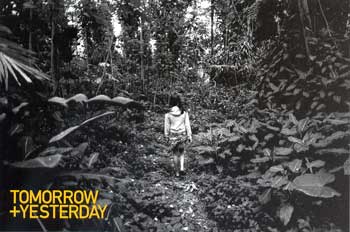 Not sure exactly what this one is trying to achieve. It was a small postcard flier for some photography exhibition that was here just before christmas.
Not particularly amazing design but I did like the detail in this particular black & white photo. It's silly...but I like the use of the plus symbol (+) in the phrase too. A little overdone maybe but somehow it still seems kind of cool in my book.
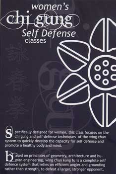 I like the font in the "Chi Gung" part of this post card. I'm not so sure what the flower illustration had to do with Chi Gung though. Maybe because this was marketed to women's classes? Hmmm....
The Chinese characters in the background are a mystery to me. Some Chinese guy I am huh? For all I know it probably says "You will kick many men's asses" Here I am with another ass comment again.
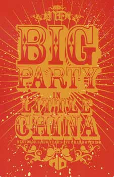 Aaaah. The circus font. I have a font kind of like this but where in the world would I ever have the chance to use it? I like this though...there's a lot of detail you normally wouldn't immediately catch in it.
There's the sun rays coming out from the back, the white speckles, the fancy flowery embellishments around the top and bottom of it. Plus the fact the designer played around with the font sizes pretty effectively.
This one really caught my eye. I like this one a lot. I forget what client I pitched to once, but a circus type design like this would have worked out well.
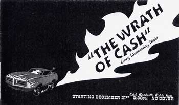 This one was kind of cheesy. But I liked it a lot as well. I mean, it could have taken the designer no more then 20 minutes to whip this up but somehow he/she managed to do a good job here.
Good job with balancing black and white compositions here. This one is just so dinky it's cool.
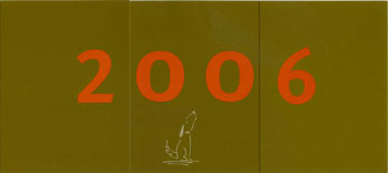 I got this card in the mail today by a local design firm I've had much respect for. Eric Woo Design. Eric and his team of print designers are great. I think what they do is pretty cutting edge and not your typical "do it like every other Hawaii trend" type design I see from other firms around town.
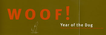 Their card is cool. When it's closed, it says "2006". Open up the flaps and it brings on the new year with a cute little "Woof!" Hahah. Very cool. Kudos!
Now I gotta think....how will I top that next year? Time to throw down the gauntlet baby! haha.
posted by Raphael @ 2:25 PM
0 comments
![]()
![]()


0 Comments:
Post a Comment
<< Home