Wandering mind...
 I saw this logo the other day down at Ala Moana Center. One of those little vendors they have near the Centerstage area. I like this logo. Well balanced, good color, good weight.
I don't know where I picked up this way of thinking (it could have been from dad) but the way I judge balance is by imagining that the logo is a physical object I can set down on a table. Will it stand up by it's own weight? Is it balanced?
This one is questionable. The "heavy" bold leaf and the tilt of the "F" will likely make this logo feel like it's weighted to the right. Plus the words "Honolulu" adds to the right. So by my own standards this one isn't balanced...but I think it gets away with my rule because the leaf is very bold and it really does counter the right side of the image.
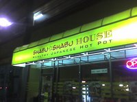
 This logo I mainly took just because it's something I would never have attempted. But I think it works. I know one of the rules my art school training had taught me was to try not to mix up too many fonts in one design. In this "Shabu Shabu House" logo they mixed it up. Are they trying to emphasize "Shabu Shabu" or "House"?
I'm not sure. But it's certainly something I have to keep in mind. I guess sometimes you can pull off something like this.
 Anyone noticed Zippy's logo? Since when did they have that round "Z" thing? I don't think they had that when I was younger. Personally, I don't like this one at all. That looks like an "L" it bugs the shit out of me. I'm not sure what the designer was trying to evoke on this one. It feels....old. Maybe that's it....they wanted to portray Zippy's as being old? Traditional?
Bah, they lost me on this one. The rest of the Zippy's logo is the one they used since I can remember. It's ok...very 80's style font but it works for them. Just get rid of that butt ugly "L"
 OK. Enough logo talk. HEY, this IS a business site for my business ok? I gotta talk shop sometimes.
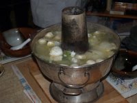
 Talk about Shabu....here's the boiler that my dad has at his house. It's pretty old school, you have to put charcoal on the bottom and it basically draws the heat up the funnel and conducts it all around the pot. I bet all my physics friends are crying right now.... maybe I used "conduct" wrong. Either way, the sucker is hot, that's all you need to know.
We had fish balls (bunch of eunich fish swimming around out there now?), beef, tofu, vegetables, & shrimp. Deeeeelish!!
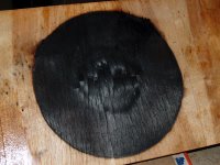
 This was the burn left over on the wood underneat the pot. I thought it looked so cool I ended up taking tons of pictures of it. In HI-RES this thing looks cool....perhaps I will make this into a cool close up poster or some kind of design someday.
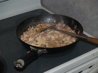
 Dad's MaPo tofu recipe. OH MY GOD this is the best thing he makes. If they mention dad's making this.... I'm inviting myself over. Dad even has the actual mapo tofu spice from the China area that invented this dish. It's like his secret stash that he uses for the genuine taste. It can get really spicey if he wanted to though.
Sheeezus I'm hungry now..... signing out. Gotta feed my face.


0 Comments:
Post a Comment
<< Home