Designs
OK OK. Back to some designs shall we? Enough mumbo jumbo about all the other crazyness in my life.
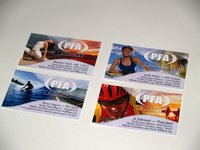 I finished some business cards for Pacific Fitness Alliance. I like the way they came out. Just like miniature versions of the website itself. At first I thought this would be as easy as just taking my original web-design and then crunching it down to biz card dimensions, but it didn't quite work out that way. The dimensions weren't the same ratio and the resolution is different as well.
So I basically had to whip each of these out from scratch but in the end it came out very nice. Bumped up the logo and just worked with the usual type layout for each person. I like how they look in a set.
Back to collecting designs I've been seeing around...I've been collecting these things regularly and throwing them all in a giant envelope. I figure I can spend $70 a crack on some design book collection, or I can just collect these myself for my own personal inspiration huh?
 Anyway, these were all pretty cool I thought. I think some of these came from the same designer. There's definitely a similar style to each of these. But he or she is pretty creative.... uses a lot of illustrations (I think I know the source), and creates these composite images that are pretty nice. This first one is in the
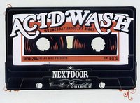 style of an airline ticket. I dig that idea.
Tape idea. Nice. Retro look... once again. Illustration. I don't have that particular font. These types of fonts are the ones you might have in your collection but you there's never a good project to use it on. I have a bunch of these kinds of never-used fonts.
 Just another cool font style I like for the "Lucky Tiger" event card. Once again, a very limited application but I like the idea. Not sure what the orange beam is supposed to be but I like the diagonal layout with the semi-transparent fonts in the background. That's always a cheat way to make something look cool...you take a font that you're using and create numerous layers under that...each one with different opacities. Overdone
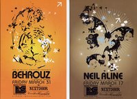 but effective.
I like this set. I've always like design "sets" when you can see several versions of one design. This one was nicely done. Once again a composite of multiple illustrations. Once again, I think I know where the designer got these illustrations from but nonetheless it turned out cool.
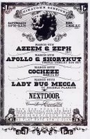 This last one I like. It's just anothe retro look inspired by carnival posters.
I guess it's all the rage these days? This one was nice though.
Hey! Lady Bug Mecca is coming...she had a cool voice. I have a couple "Digable Planet" albums from back in the day. Smooth! Maybe I should go!



0 Comments:
Post a Comment
<< Home