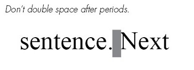
Don't double-space.
I delivered a presentation to my BNI chapter this week. All 10 minutes of it. Actually 10 minutes isn't a whole lot of time. I actually had to rehearse at home quite a number of times to just get my points across within that time frame. In the end, I ended up delivering this presentation seated at a Chinese restaurant round-table because our normal meeting place at Gordon Biersch was booked up because of the Pro-bowl event. It was quite unnerving talking in the middle of a Chinese restaurant so I probably screwed up anyway. BAH, whatever.
I decided I'd give some free basic design tips to my fellow business associates. I figure that will keep them somewhat interested in the topic of design. I think it worked ok.
I might as well give those same tips to you...my silent readership. These are just basic 101 tips, so don't expect miracles.
Tip #1:
 I think I was among the last generation to learn typing behind an actual typewriter. My younger brother may have grown up never having even touched one of those contraptions at all can you believe it? In typing class, they always used to tell us to double-space after each period.
However, today it's considered bad form in Typography to double-space.
To this DAY, I still double-space myself. It's a super hard habit to break. I type really fast so it's all just muscle-memory when I type. So now every time, I have to go back across my documents and do a search-&-replace to get rid of all the double spacing. It's annoying.
The reason behind this is that in the days of the typewriter, each stroke of a letter is spaced equally between each other, what they call "monospaced". So having a larger space between sentences helped to give the reader a visual signal when a new sentence would start.
Today, with this newfangled gadget called a COM-PU-TUR, fonts are already designed to somewhat accomidate these reading signals. When you hit that spacebar, the computer is already told to adjust it with a reasonable amount of space to keep the flow of the text comfortable to everyone. Too much space would just start leaving holes in your text.
OK, so now you're all gifted with the knowledge of the single-spacing...go forth and prosper.


3 Comments:
Hey Raph, thanks for the tip. I will try it out. It does look nice on your blog. Although, it is an EXTREMELY hard habit to break! I have another question about blogging and web pages, if you could indulge me, da uninformed portagee...how do I post a photograph next to my display name? Thanks Raph, the wild web wizzard! If you are not sure who I am ask BigDaddy.
Shoots. I'll post a followup article on this. My next post will be about how to prepare different types of images.
If you're looking to set up a Blogger account profile image like the little cute adorable guy I have in my logo....look under your 'dashboard' when you first sign into Blogger.
There should be a link that says "Edit Profile". Under that you'll see an option where it says "photo URL". You'll have to find a place where you have your photo stored online somewhere so that there's a website address to it.
If you have no idea what I'm talking about, send me your image and I'll upload it in my directory and give you the address you can paste in there to make it work. :)
Post a Comment
<< Home