Less Is More
This is one of these that just seems so rudimentary to design that I tend to forget that it's not something that comes natural to everyone.
Tip #3: Less is more.
Whenever you're designing something...whether it be a Christmas card for family, or a Website, keep in mind that it's usually best to keep it as simple as possible. Don't overload your page with text and information.
Here's an example:
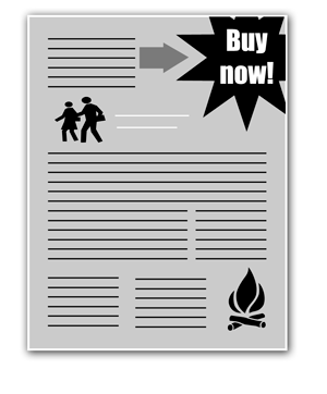 This is like a typical layout you might see on a convention flyer. Even I've been asked to do this sort of layout before and I've done it because it's what I've been payed to do. Sometimes people feel like if there's still space left on the page, it needs to be filled.
The problem with this is that you're actually working against yourself. How many times have you actually spent more then 2 seconds looking at a convention flier and read every last detail? Not very often. The same thing applies to websites...the more text and information you put up, the less inclined people are to read it. I'm surprised you've even read this article this far....
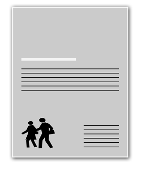 What you should always aim to do is to get your point across with as little material as possible. The idea isn't to be minimalistic, but it's more an effort to be precise.
A clean and simple layout makes it easier to direct your viewers attention to the information you want them to see. Don't be afraid of "white space" (or negative space). I had an instructor once who made us spend weeks just studying how to maximize the white space on a page....it's SO important because it gives your viewer a pause between thought.
Without an adequate amount of white space, text would be unreadable, graphics would lose their emphasis, and there would be no balance between the elements on a page.Fine art and photography uses similar standards. You see it a lot when people talk about composition. The ideas about composing your images so that there's a lot of contrast between positive and negative spaces is a lot to do with the same idea of creating focus.
Remember the K.I.S.S. rule -- Keep It Simple Stupid
posted by Raphael @ 12:24 PM
0 comments
![]()
![]()


0 Comments:
Post a Comment
<< Home