Vector Images
Hey are you bored with my tutorial tips yet? Hey, it's either deal with these tips or hear my grumble about my taxes again.... yeah, this would be better now wouldn't it?
Remember I promised you I'd show you the TWO ways that your computer looks at graphics? Last time I covered the pixels. So if you have a graphic of your logo or something and you tried to blow it up, you'd get something that looks like this:
 Butt ugly isn't it? In fact, if you look at old school computers, the lettering and graphics looked even worse then this. Remember those Tandy's and Ataris? OK, I'm dating myself.
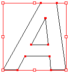
Now some bunch of geniuses sat around their computers somewhere along the line and decided that they should make the computers look at graphics in another way. That's with using LINES instead of these pixels.
 It's a bit like how you would draw your connect-a-dot artwork in elementary school and then you color in the completed shapes. The beauty of this is that it's all done with fancy math...so you can now drag these "vectors" as big or small as you like and you'll always have a sharp image.
 Great isn't it? Well, there's a catch.... vector graphics are only good for anything with solid blocks of color and shape. i.e., logos, fonts, & illustrations. It's no good for photographs where there's shading, depth and full ranges of color.
Tip #4: Here's a cheat sheet to remember what types of graphics are best for your different tasks
Images = looks better as a rasterized image (whoops, new word here = using pixels)
Fonts & Logos = looks better as a vectored, or lined, image
Common formats you probably recognize but never knew the difference:
GIF -- raster format; good for web logo graphics
JPEG -- raster format; good for web photographs
TIFF -- raster format; best quality; good for photographs you plan to use for print
EPS -- vector format; good for illustrations & logos
OK, I'm getting bored out of my mind just writing this. How did I ever graduate school with such a short attention span?


0 Comments:
Post a Comment
<< Home