Another one?
When it rains it pours...
Yeah, I churned out another logo. I got more coming don't worry. Suddenly this quarter it's like I got bombarded with logo work. I really didn't do that much promotion in this area...I guess it's just a lucky thing I suppose.
Here's one where I'll show you both the rejected version and then the final one. First the rejected one...
 I think we all liked this one. I had fun creating this and my client really liked it. BUT, the problem is that this looks like he's selling diamonds. That's not the case...he runs a video and photography business. So we had to reluctantly scrap this idea....
 Here's the final version. What I did was take a photo of the actual video camera they use in their business and created this illustration for them. I had recently done another logo for another photographer so the problem I had was trying to come up with a whole new set of ideas for this profession.
Finally it occured to me that I should look at some of the ideas I had for that other photographer and look to see if there were concepts here we could recycle into a new logo. We ran with it.
I modified it so that the diamond shape is still worked into the logo. The script font may not have been my first instinct on a tech-related logo...but the nature of this photographer's work leans more towards wedding & ballroom dancing video work so we kept to his original classic approach.
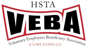
And...............another logo this week for the Hawaii State Teachers Association's Member Benefit Association:
 This one wasn't really that hard. My client had a very clear picture what he wanted in my head and all I had was a tiny grey sketch to go by. This was more just a practice in using Illustrator warp effects and some offset work to create the bordering.
Boy... believe me it's been a struggle keeping creative logo after logo like this. I'm going to have to do some road research to come up with fresh sources of inspiration! Awe!


0 Comments:
Post a Comment
<< Home