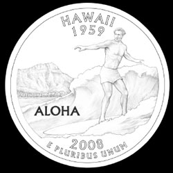
The Quarter
 Remember when we were kids in the playground and some bully would come up and say, "Eh, I like one quarta!"? I bet they could care less about the fancy design on the coin. Oh the good 'ol days. /sigh.
Apparently we're getting near the point that the U.S. commemorative quarters is coming up to our State of Hawaii. The State has this informal survey for public opinion on the designs.
http://www.hawaii.gov/polls/index.php?pollsID=1
Make your choice known. I don't know myself. While from a design standpoint I think the one above is the nicest, it just doesn't mean that much to me to have a surfer on our coin. It's probably the most shallowest of meanings among all the other coin designs. But at least this one has a foreground, middle ground, and background to it.
The other designs with just the islands is lame to the most lamest degree. How many uku billion times do Hawaii designers need to put the shape of the islands in our designs? Sheeeeeeeeezus. Aside from maybe Texas, I don't see any other State as fixated on geographical landscape as we are. Imagine people in Kansas wanting thier State map showing up in their coins:
King Kamehameha & the Hula Dancer are good symbols. But they didn't work out a good composition for any of them except for the one where Diamond Head is placed behind the King.
Whatever, I better get back to work to earn more quarters.


0 Comments:
Post a Comment
<< Home