People in my field of design can get really into Typography. And that’s not a bad thing necessarily. But we’re talking REALLY into it – as in, if you use this font you’re “boring” and “amateur”, another font you’re too trendy, too conservative, too ugly…“yadda yadda….I mentioned the bisque” Sorry, another obscure Seinfeld reference creeping in.
Me? I enjoy it studying it a bit as an area of interest…I’m amazed at the thought that goes into a font as to how well it reads, the history that’s associated with them, and the decision process in which ones to use for what purposes. But as to labeling people who choose one font over another? Meh, who the fuck cares.
One person looks at Helvetica and says “that’s the most perfect font I’ve ever seen I’m going to use only this font for the rest of my life”, yet another person might say “hell, this font is used so often I’m sick of it I never want to see it again.” Whatever, I just try to use what looks good and sets the right mood for me and my clients.
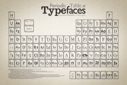
It’s no surprise that I had a little nerdgasm finding this little fun Typography meets Periodic Table chart that was designed showing some of the most popular fonts ranked by family & popularity. It’s nice to have a reference chart the next time I want to experiment with a font I’ve never tried using. (design by Squidspot via Lifehacker)


 LoweStudio Inc was founded by me, Raphael Lowe, a Honolulu based illustrator and web designer. I presently design and manage a few dozen commercial websites, but my main focus these days is acting as the head developer for Kapiolani Community College and teaching