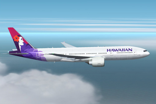
Athough not particularly new, I’ve always admired Hawaiian Air’s logo for quite some time now. I can’t seem to find information on who designed it though. Anybody out there know?
It’s got a good balance – while it uses very common symbology I see all the time with Hawaiian logos, this one with the profile of the woman feels very friendly and positive to me. The colors is nice too…especially set against the tail of their planes.
The type feels a little retro to me. Although I do like the weight of it next to the mark.
Nice work whomever did this!
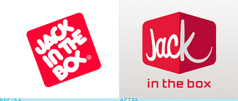
Anybody notice that Jack in the Box has been using a new logo as well lately? I really like it as well. The old one has this 80’s-ish balloony font that needed to go, while the new one has a more contemporary 3D box feel to it mixed in with some nice font that reminds me of House Industries fonts.
I even like the fact it’s off kilter a bit…that’s probably intentional to leave enough space for the smiling tail of the “K”. Not everyone likes it. More discussion about the Jack logo can be found on Brand New


 LoweStudio Inc was founded by me, Raphael Lowe, a Honolulu based illustrator and web designer. I presently design and manage a few dozen commercial websites, but my main focus these days is acting as the head developer for Kapiolani Community College and teaching