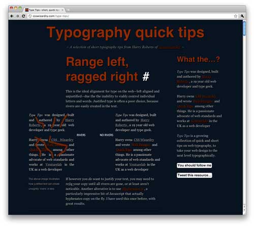
This is a great collection of tips of web typography tips. Some of these I actually wasn’t aware of. Hard to keep track of the growing flexibility of web type these days.
While my interest in typography has been steadily increasing for both online work and in print, I’ve had a love/hate relationship with it for web work.
Good typography is like “good coding” – if you it well, the viewer shouldn’t even notice it. Which in itself is great! But it’s also very hard to bill for good type or good coding. The average client just doesn’t get it.
You ever tried to answer a client’s question why you charge 20% more than the next guy with, “Well, it’s because I take more time making my ellipses with a proper HTML tag rather than 3 full stops, and you’ll notice all my quote marks are inverted on the end?”
No I haven’t either. There’s always going to be a competitor out there who can underbid you because they don’t give a shit about these type details, and neither do most clients.
I find my best middle ground is to tell people that “I try to pay attention to details” and hope that the work will somehow imbue that unspoken quality to them.


 LoweStudio Inc was founded by me, Raphael Lowe, a Honolulu based illustrator and web designer. I presently design and manage a few dozen commercial websites, but my main focus these days is acting as the head developer for Kapiolani Community College and teaching