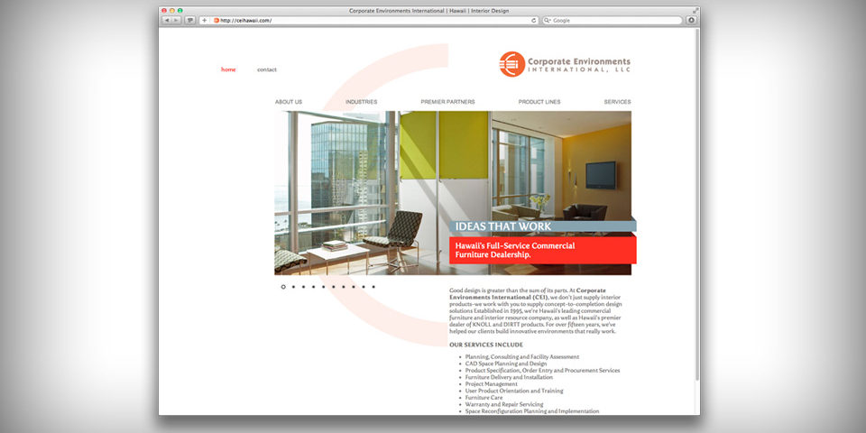
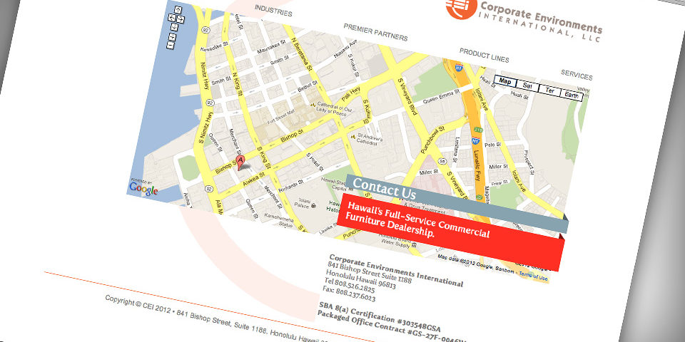
Corporate Environment International specializes in very beautiful high-end corporate & government furnishing. One walk into their office space is like seeing your dream office that you can’t have. It was sleek, minimal, and yet functionally cool. I wanted to try to duplicate that feeling on their website…here I tried a “minimalistic” design concept that mimicked the orientation of their logo mark. I felt the minimal look would allow audiences to concentrate on the images rather my design itself.
Overall I’m pretty pleased with this result, it needs to evolve a little bit to suit some of their extra needs lately, but I think I designed this site well enough that it will evolve gracefully.


 LoweStudio Inc was founded by me, Raphael Lowe, a Honolulu based illustrator and web designer. I presently design and manage a few dozen commercial websites, but my main focus these days is acting as the head developer for Kapiolani Community College and teaching