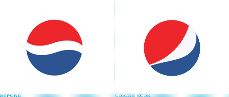
I haven’t been back to “Brand New” for a while, but I’m glad I did. Looks like they have a new list the “Best & Worst Branding of 2008”. (via: BrandNew)
I generally agree with some of the picks. The Pepsi one above I didn’t really notice until they commented about it here. The other week I was having lunch with my wife and I remember saying, “Hey, look the Pepsi can looks different…”. I didn’t even spot the logo change.
While the new symbol doesn’t thrill me to death. I still think it’s a marginal improvement over the original flaccid wave that just doesn’t really say much at all.


 LoweStudio Inc was founded by me, Raphael Lowe, a Honolulu based illustrator and web designer. I presently design and manage a few dozen commercial websites, but my main focus these days is acting as the head developer for Kapiolani Community College and teaching