I delivered a presentation to my BNI chapter this week. All 10 minutes of it. Actually 10 minutes isn’t a whole lot of time. I actually had to rehearse at home quite a number of times to just get my points across within that time frame. In the end, I ended up delivering this presentation seated at a Chinese restaurant round-table because our normal meeting place at Gordon Biersch was booked up because of the Pro-bowl event. It was quite unnerving talking in the middle of a Chinese restaurant so I probably screwed up anyway. BAH, whatever.
I decided I’d give some free basic design tips to my fellow business associates. I figure that will keep them somewhat interested in the topic of design. I think it worked ok.
I might as well give those same tips to you…my silent readership. These are just basic 101 tips, so don’t expect miracles.
Tip #1:
I think I was among the last generation to learn typing behind an actual typewriter. My younger brother may have grown up never having even touched one of those contraptions at all can you believe it? In typing class, they always used to tell us to double-space after each period.
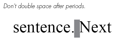
However, today it’s considered bad form in Typography to double-space.
To this DAY, I still double-space myself. It’s a super hard habit to break. I type really fast so it’s all just muscle-memory when I type. So now every time, I have to go back across my documents and do a search-&-replace to get rid of all the double spacing. It’s annoying.
The reason behind this is that in the days of the typewriter, each stroke of a letter is spaced equally between each other, what they call “monospaced”. So having a larger space between sentences helped to give the reader a visual signal when a new sentence would start.
Today, with this newfangled gadget called a COM-PU-TUR, fonts are already designed to somewhat accomidate these reading signals. When you hit that spacebar, the computer is already told to adjust it with a reasonable amount of space to keep the flow of the text comfortable to everyone. Too much space would just start leaving holes in your text.
OK, so now you’re all gifted with the knowledge of the single-spacing…go forth and prosper.


 LoweStudio Inc was founded by me, Raphael Lowe, a Honolulu based illustrator and web designer. I presently design and manage a few dozen commercial websites, but my main focus these days is acting as the head developer for Kapiolani Community College and teaching