 I’m going to be teaching an upper level New Media class on interface design this next semester. It’s supposed to be “easy” to teach, but as is the case with any class that I’m teaching for the first time, there’s a lot of prep time involved.
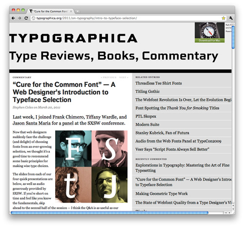
I figured it’s a good idea to spend the summer collecting any resources I can. Yesterday I stumbled across a good discussion about the basics of choosing good web typography. It’s no secret that I’ve always felt challenged with typefaces (I know I’m too conservative), so I found this interesting. I think this would be a good thing for students to check out…assuming they don’t fall asleep past the 2nd slide. (via Typographica)

 LoweStudio Inc was founded by me, Raphael Lowe, a Honolulu based illustrator and web designer. I presently design and manage a few dozen commercial websites, but my main focus these days is acting as the head developer for Kapiolani Community College and teaching