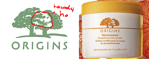
I sat in front of an Origins store yesterday as I was waiting on a meeting nearby. Origins sells those skin care products that smell funny. My wife once wanted their ginger smelling cream.
I couldn’t help but notice their logo…
Is it just me or does anyone else see a white skull peeking out between the trees?
I can only assume this is unintentional. Or maybe it IS intentional to tie into the “origins” like it’s some life and death thing? OR the logo designer thought it to be some sick inside joke like the way there have been Disney artists who have drawn hidden penises in children’s cartoons.
Otherwise, a skull isn’t something you’d want people to picture after they’ve applied a thick layer of “Gloomaway” to their face.


 LoweStudio Inc was founded by me, Raphael Lowe, a Honolulu based illustrator and web designer. I presently design and manage a few dozen commercial websites, but my main focus these days is acting as the head developer for Kapiolani Community College and teaching
you are not the only one that has seen that. i noticed it too. i think you are right when you said it has to do with the origins of man.
Maybe so. Yet somehow I’d still be somewhat apprehensive of designing something with as many negative connotations as a skull in my logo eh? Especially a business that’s tied into rejuvenating skin care products.
I walk past the Origins store every day in Manhattan, and from the first time I saw the logo I always saw a creepy skull. Maybe I am just a designer who looks into this stuff too much. However, for as large of a business as they are, I am very surprised that this made it to be a final logo without anyone seeing that skull. To me it is clear as day. Glad to know I am not the only one.