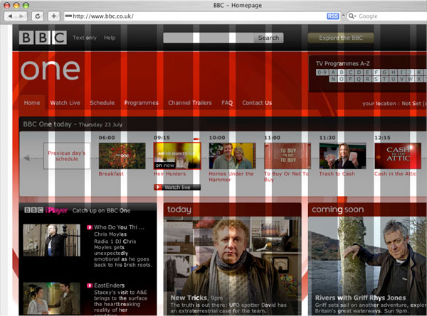
Last week a friend of mine posted a tweet from the BBC that demonstrated the level of work they went through trying to come up with a new website look.
Take a peek…it’s pretty interesting the level of detail and work that they went through. Now the next time you approach a designer and ask for something “easy”…keep in mind that it’s a lot of work to achieve that.
Personally, I think it was a little overkill in this case. The end result, while nice and clean, wasn’t something that floored me. Not that a news organization like the BBC needs to have fantastic graphic design, but I guess I think the end-result could have been accomplished with a lot less planning (get to the part where they’re counting the pixel grid?)
I get it, sometimes when you’re working with a team, this level of planning is necessary to get everyone working uniformly, but having seen many column and grid websites before it’s not like they couldn’t have based their grids off of any number of pre-made CSS templates and just built from that?
Well, in any case, it looks like it was a successful project and I love reading about how creative teams go through their process.


 LoweStudio Inc was founded by me, Raphael Lowe, a Honolulu based illustrator and web designer. I presently design and manage a few dozen commercial websites, but my main focus these days is acting as the head developer for Kapiolani Community College and teaching