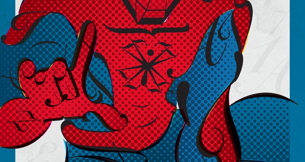
Artist Matthew Olin created these fun superhero profiles using characteristics in various typefaces. Love them! The most distinguishing factor of any font is its characters. Hidden beneath these characters, each typeface also has character—its own unique characteristics. However classified this information may seem, when used correctly, typefaces often...
Read MoreRedesigning the Windows logo
I continue being more fascinated reading or looking at an artist’s process then seeing the actual result. Give me a finished Michelangelo painting I’d be amazed sure…but show me his rough sketches in his notebook I’m even more impressed. So this article about the thought process behind the new “Windows 8” logo design...
Read MoreType Games
This has gone around a bit. Kern Type and Shape Type are two sites built entirely in HTML5 allowing the designer and non-designer types alike a peek into the world of Typography. I scored 91 on Kerning and only 75 on Shape. Which was still encouraging because I don’t consider myself that proficient with Type. If you’ve never worked with...
Read More16 pixel text size!?
I stumbled across an article today claiming that 16 pixels should be the minimum font size across the web. It’s got some good points worth considering. All this time I’ve been more comfortable using 13 or 14 points as my standard minimum body text. Not quite because of any specific reason beyond “it just feels more comfortable to...
Read MorePower Switch art
5,000 power switches + patient artist = awesome art (Valentine Ruhry via Quipsologies)
Read MoreIntro to font selection
I’m going to be teaching an upper level New Media class on interface design this next semester. It’s supposed to be “easy” to teach, but as is the case with any class that I’m teaching for the first time, there’s a lot of prep time involved. I figured it’s a good idea to spend the summer collecting any resources I...
Read More

 LoweStudio Inc was founded by me, Raphael Lowe, a Honolulu based illustrator and web designer. I presently design and manage a few dozen commercial websites, but my main focus these days is acting as the head developer for Kapiolani Community College and teaching