As I mentioned before, I’m not that IN to typography. But I DO find it interesting despite the fact I don’t often think enough about things like “ascenders”, “terminals”, “bowls”, etc.
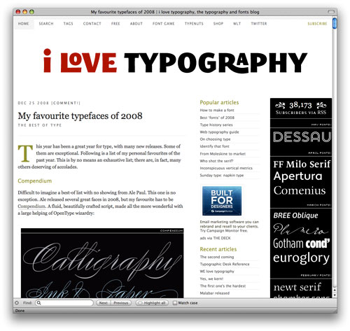
So I wandered onto this really rich resource of font information on this site called “I Love Typography” which I thought was pretty nice. There’s a list of what they thought was some of the best new fonts of 2008. There’s a couple I really like…perhaps I’ll see if I can work them into a project someday.
Such a lazy ass huh? This is like the cliff notes of my design field.


 LoweStudio Inc was founded by me, Raphael Lowe, a Honolulu based illustrator and web designer. I presently design and manage a few dozen commercial websites, but my main focus these days is acting as the head developer for Kapiolani Community College and teaching