Tax season has come and gone but unfortunately I’m not done yet. We have an extension out this year because we’re using a new tax agent who has to work out the kinks. Early indication is I have to pay a few grand of taxes this year with is bittersweet. I realize I only have to pay taxes if I have incoming money to begin with, but it still hurts nonetheless to see my hard earned savings get depleted in an instant. It’s no secret I hate doing accounting and taxes. So much so I’m more than willing to pay people for that type of help. As it stands, my bookkeeper does everything and just seasonally tells me to sign here and sign there to get my taxes done. I’d otherwise have to spend many grumpy nights searching for forms and figuring out how to fill them out.
Perhaps if the government created more user-friendly approachable forms we’d all feel more confortable doing taxes routinely?
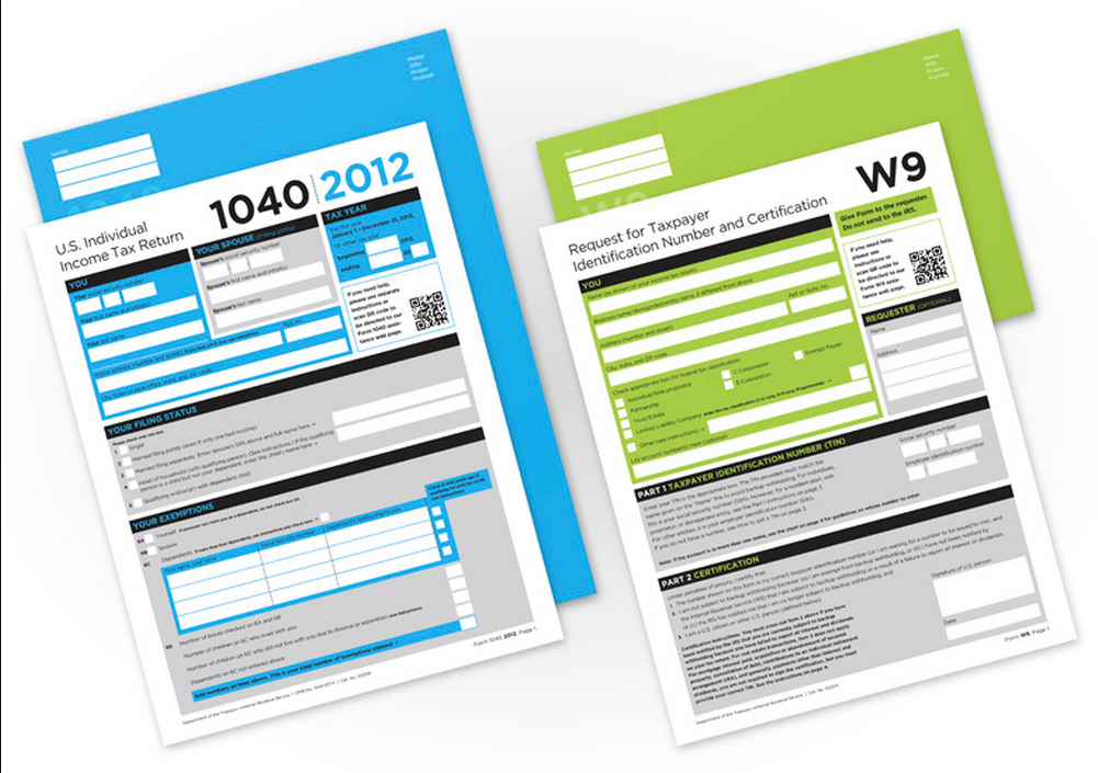
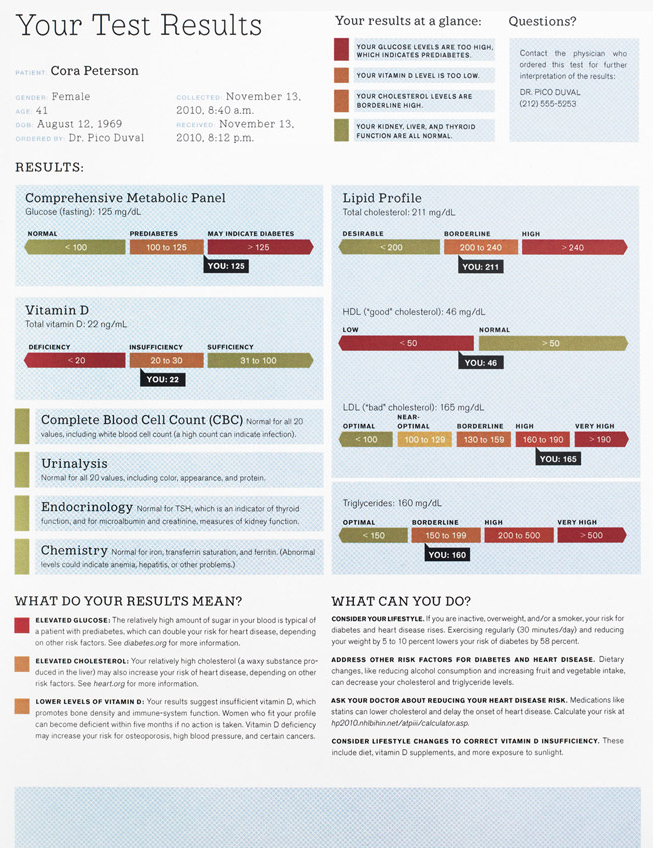
I guess that’s the thought process behind these concepts by FormNation LLC where they redesigned form concepts for the standard 1040 and W9. It reminds me of the project that Wired magazine covered a couple years back showing a graphic design makeover of medical forms. Both of these standard document originals make my head hurt…my wife sometimes gets grumpy at me when I stare blankly at my latest medical checkup report “It’s RIGHT THERE!” But in each sample, the redesigns are clear, engaging, and colorful.
Everyone takes for granted the fact that these forms and documents are purely utilitarian, but these concepts prove that you can present the same amount of information to the end-user in a much clearer fashion. (via Gizmodo)


 LoweStudio Inc was founded by me, Raphael Lowe, a Honolulu based illustrator and web designer. I presently design and manage a few dozen commercial websites, but my main focus these days is acting as the head developer for Kapiolani Community College and teaching