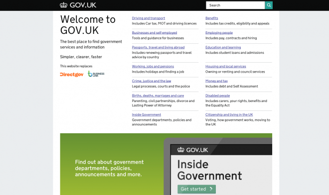
Gov.UK
Interesting to find that this site, Gov.UK, is getting so much coverage by sites like Gizmodo and Wired lately. Why? Well, it was named “2013 Design of the Year” by the London Design Museum not because of any bells and whistles. In fact, it has very little in the way of graphics or flash. What it is does somewhat effectively is present a LOT of information clearly.
I do like it. It’s especially relevant to me professionally lately because I’ve been wading through this incredibly difficult project organizing a college website. My challenge isn’t so much the design (which will have to be addressed in time), but it’s having to unravel 10+ years of content & organization atrophy. This Gov.UK site will provide some much needed inspiration just at the right time.


 LoweStudio Inc was founded by me, Raphael Lowe, a Honolulu based illustrator and web designer. I presently design and manage a few dozen commercial websites, but my main focus these days is acting as the head developer for Kapiolani Community College and teaching