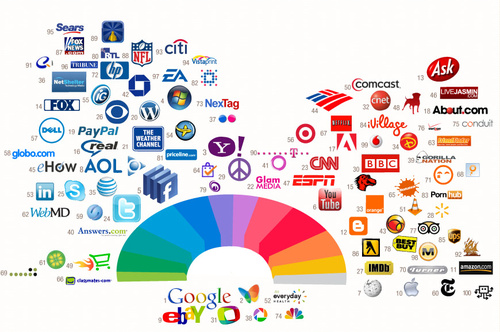
Again yet another very fascinating infographic demonstrating some of the most used colors for web brands and icons. What’s interesting to see is how certain industries fell into similar color categories despite the fact that in many cases the colors were picked without much research on the part of the creators (e.g., Facebook)
Hmmm…from the looks of the chart distribution above, I gotta get to working on some violet logos. *grin* (via colourlovers)


 LoweStudio Inc was founded by me, Raphael Lowe, a Honolulu based illustrator and web designer. I presently design and manage a few dozen commercial websites, but my main focus these days is acting as the head developer for Kapiolani Community College and teaching