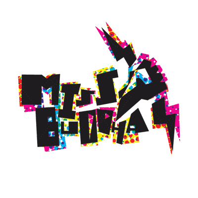
Here’s a concept I quickly whipped up for my band “Miss Buddha”.
I’m not sure. I was pretty excited about it at first. I liked the spirit of it…it’s very Sex Pistol-esk. I intentionally did it very fast and furious to try to get the energy of the music we played. And I noticed a lot of the iconic punk groups always have very chaotic, almost cheap looking logos. With the exception of the Dead Milkmen who have a dead cow. I wanted this cheesy 80’s vibe to it too so I did the halftone color thing to spruce it up. (Funny how the cheesy 80’s have kinda slipped back into fashion lately…I lived through that era and there’s nothing fashionable about the checkerboard shoes and the pink blazers, trust me)
And then I showed this to a couple band-members and they didn’t come across looking very enthused about it. “It’ll look good on a shirt”. I think I can loosely translate that to, “That looks like crap Raph, we’ll put it on a shirt so you don’t feel like you wasted your time”.
Bastards. (Funny how I make up their responses and complain about it huh?) I think that about explains why I don’t do work that’s too involved with my own personal life.
OH, we got a couple of shows up this Friday and Saturday if anybody wants to come check us out.
October 10 9:00pm – Sand Island Club w/ SheCanDevour
October 11 8:30pm – Higher Ground Cafe & Music Club w/Make the Change & Pimpbot
This is my own first time playing at those venues so your guess is as good as mine how it’ll turn out. Come out and say hello!


 LoweStudio Inc was founded by me, Raphael Lowe, a Honolulu based illustrator and web designer. I presently design and manage a few dozen commercial websites, but my main focus these days is acting as the head developer for Kapiolani Community College and teaching