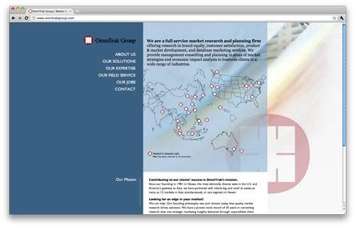
A soft launch for one of my latest web projects for OmniTrak Group Inc.
I’m pretty proud of this site…I mean, while it’s not the flashiest of sites out there, it’s using CSS and HTML techniques that I’ve kinda always been hesitant to do because I never felt it was safe enough to do them. You know, “safe” as in “it’ll look good on one browser and look like shit in IE” kind of thing. But through a bunch of trial and error we got this all working and I learned a bunch of stuff in the process.
Close your eyes of you don’t like geek speak. Here are some of the points about this site I like:
- first time really goofing around with multiple z-index layering for the background elements. Something you kind of need a bigger monitor to fully appreciate but it’s there.
- CSS friendly map on the homepage that should be accessible even to non JS users. Thanks to A List Apart for another great writeup about that.
- experimentation using CSS aRGB values to replace transparent PNGs. IE still coughed up a lung but managed to whip that into compliance.
I look forward to working with OmniTrak to get more photos and multimedia in this site over time…which was part of the original goal of this particular design.


 LoweStudio Inc was founded by me, Raphael Lowe, a Honolulu based illustrator and web designer. I presently design and manage a few dozen commercial websites, but my main focus these days is acting as the head developer for Kapiolani Community College and teaching