
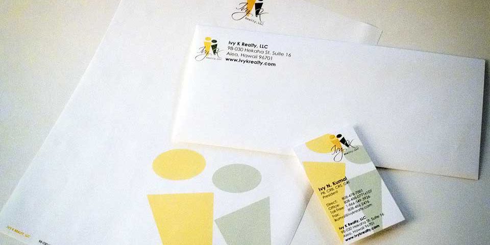
One of my earlier projects that I was very proud of. The client loved the result of this logo & stationery system design. The concept behind the leaning figures represented the relationship between realtor & client, or parent & child…exactly the sentiment that the company wanted. All the while I was happy to incorporate the initials of the company owner into the logo mark itself. Can you see it?
In hindsight I wish I could go back to this one and work on the type a bit. But c’est la vie.
 LoweStudio Inc was founded by me, Raphael Lowe, a Honolulu based illustrator and web designer. I presently design and manage a few dozen commercial websites, but my main focus these days is acting as the head developer for Kapiolani Community College and teaching