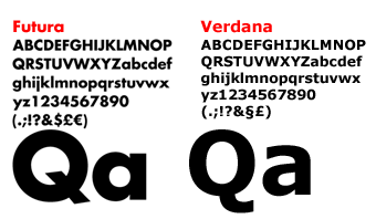
Here’s another font-related issue for your type purists out there. This was brought to my attention by a friend (and occasional reader) of mine who signed a petition on the issue that IKEA changed the design of their marketing material to use the Verdana font as opposed to some of their offshoot Futura fonts they’ve been using these many years. There’s more information from a ranting designer here. (via Iancul)
Personally, I’m not sure what to think. I’m not a big fan of using Verdana (I think I might have used it once or twice in the past for some website paragraph style or something), nor do I really follow IKEA to the point where I’d alter my life over it. Maybe because I’m bitter that IKEA isn’t here in Hawaii?
I think as designers, we’re definitely paid to be more anal about things that may seem very trivial or even unnoticeable to the general public. So this is definitely not a topic I’d be quick to dismiss.
BUT on the other hand, it’s often my point that there’s beauty in everything…so what that this font isn’t as perfectly balanced as that font, or that this one is more over-used than the next? Can we not explore design using things that may be considered plain or even ugly by today’s standards? Much like I admire a fine painting if I can see the artist’s imperfect underlying sketch-work, I’d admire a designer who could take something I would never consider in my own design and she made it look good.
I don’t know though…there’s no hope for Comic Sans.

 LoweStudio Inc was founded by me, Raphael Lowe, a Honolulu based illustrator and web designer. I presently design and manage a few dozen commercial websites, but my main focus these days is acting as the head developer for Kapiolani Community College and teaching
Hmm… Verdana was designed to be legible on computer screens, and it really doesn’t hold up very well in print, so this seems like a very poorly-educated decision on the part of Ikea. Some of the best designs out there (particularly industrial design and other related disciplines) are indeed “unnoticeable” to the general public, which is the whole point, kind of—they would notice, though (even on a subconscious level) that the world around them was a little uglier and less functional if designers were less thoughtful about the decisions we make. I realise that this little rant will probably fall on deaf ears, though, since I’m preaching to a guy who lives in Hawaii (:
Thank you for your feedback Leonidas.
Yes, I DO get it believe me. Maybe it’s just the level of fervor around the topic that I just don’t feel to the same intensity? Maybe you’re right…it’s hard to feel that upset about something like this when I look out the window I see blue ocean and sunlit skies.